
The Pareto Chart Widget
You can see projects ranked against a metric on the dashboard using the Pareto Chart widget. The Pareto line is a cumulative percentage per Opportunity of a metric value against the total. See Widgets Overview for information about how to add each widget and additional options.
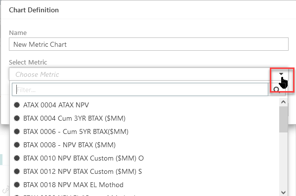
Adding Pareto Chart Widgets to Dashboards
- Set up the chart.
- Enter the name for the chart in the Name field.
- Select the scalar metric to display in the chart.
- Click OK to create the chart.
- Re-size and reposition the widget, as required.
- Click the Save button to save the dashboard.
Click image to expand or minimize.
Chart Widget Options
- The Group control on the Dashboard does not modify the Pareto Chart.
- The Time filter control on the Dashboard does not affect the Pareto Chart. Scalar metrics are time-based.